The first tool any Data Scientist must familiarize themeselves with (if they work primarily in Python) is the Pandas library.
The Pandas library is essentially a way to emulate SQL functionality within Python. For those without a programming background, SQL (Structured Query Language) is a language typically used to communicate with databases stored on servers.
For my first foray into data manipulation, I used Pandas, along with the matplotlib.pyplot and seaborn libraries to clean, explore, and visualize MTA turnstile data, freely available online.
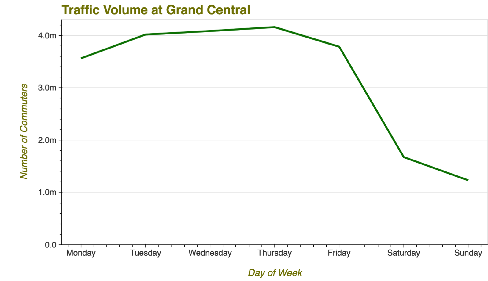
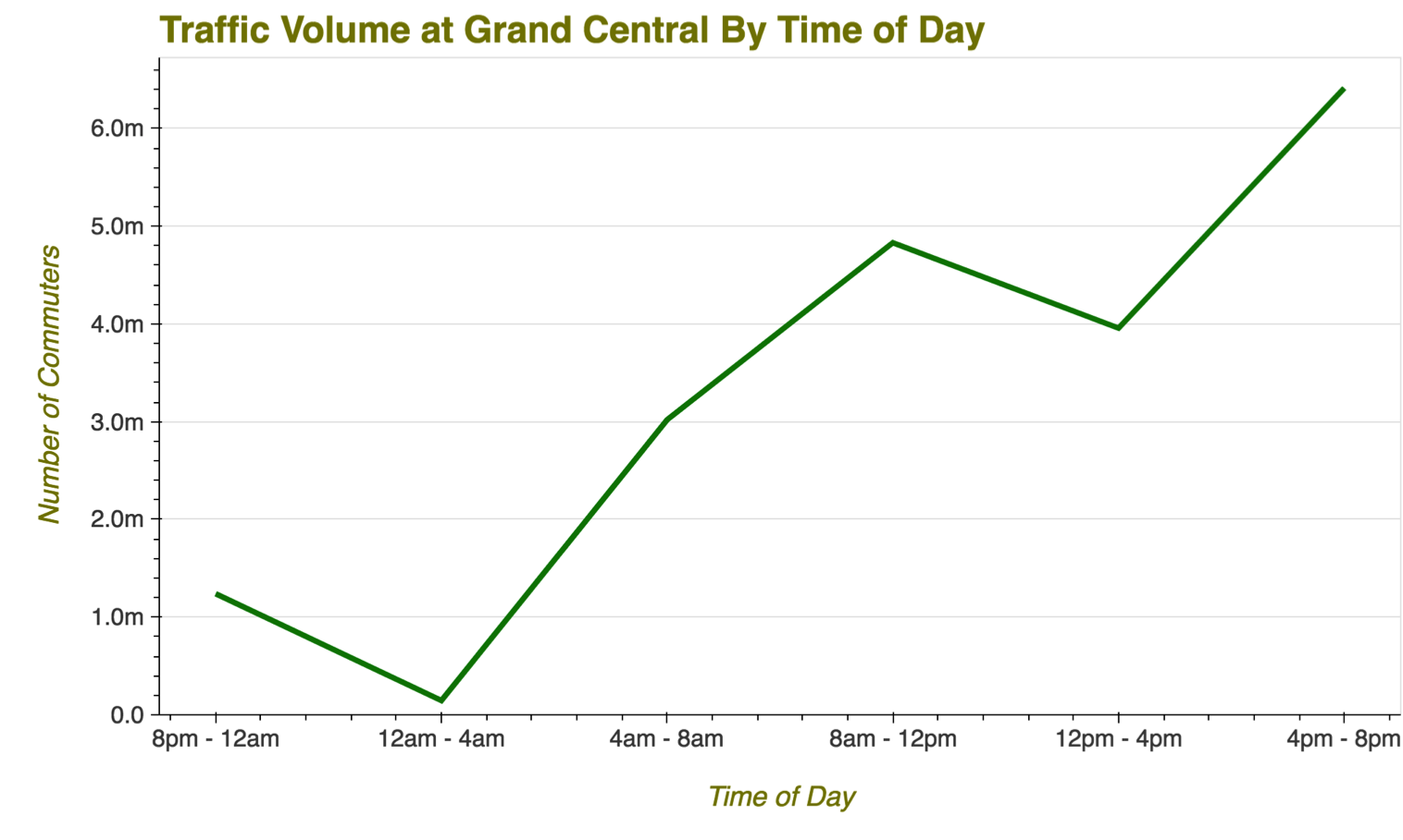
An imaginary challenge was posed: Come up with a plan for manning the busiest station in New York City with NYPD officers when under threat of a terror attack. Essentially, we want to determine the busiest times for the station, and ensure it is adequately staffed at peak demand hours
The first step was to clean the data, and make sure we had the necessary features in our dataframe to solve the problem. Because the turnstiles counted entries as a cumulative value, we had to create a column which subtracted the entries on a given day from the entries on the previous day to get absolute entries for that day.
Another issue we found is that the counter for entries reset every so often, resulting in some ridiculously high numbers on some rows. For simplicity’s sake, we simply removed those rows as they were few and far between.
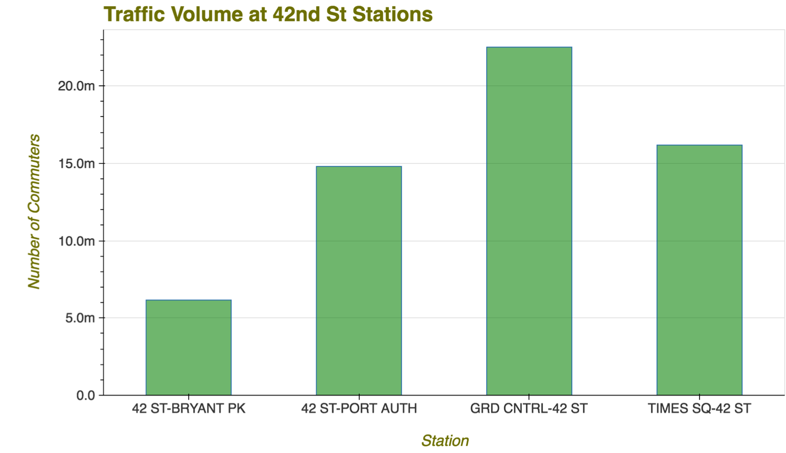
To solve the challenge, we first had to identify the busiest station. To do this, we used Pandas to display each station in descending order of highest daily ridership. We were not surprised to learn Grand Central Station was the busiest in the city.

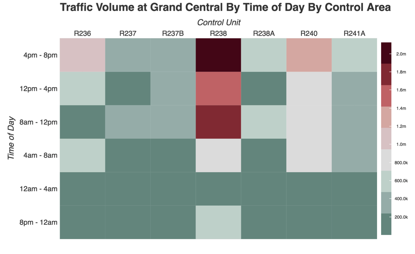
Following this, we drilled down to each turnstile group in the station, and determined which areas of the station had the most traffic at different times.


Leave a comment